Course Overview
This is not just another Power BI course.
This is a practical, career-focused data visualization and business intelligence training designed to help you:
What You’ll Get
✔ 3 hours of intensive hands-on Power BI training
✔ Step-by-step dashboard building tutorials
✔ Real-world business datasets and case studies
✔ Beginner-friendly explanations of Power BI concepts
✔ Practical exercises and guided projects
✔ Data cleaning and transformation with Power Query
✔ Data modeling and relationship building
✔ DAX fundamentals for calculations and KPIs
✔ Interactive dashboard and report design techniques
✔ Portfolio and career guidance for aspiring analysts
What Makes This Different?
Most people learn Power BI but still struggle to:
This course changes that.
You won’t just watch tutorials. You’ll build practical dashboards and reporting systems used in real organizations — step by step.
What You’ll Learn
Power BI Fundamentals
Data Cleaning & Transformation
Data Modeling & DAX
Dashboard Design & Visualization
Business Intelligence & Insights
Career Development
Who This Course Is For
✔ Beginners with no Power BI experience
✔ Students learning data analytics skills
✔ Professionals working with reports and business data
✔ Aspiring data analysts and BI developers
✔ Entrepreneurs and business owners
✔ Anyone looking to make smarter decisions with data
Real Impact
✔ Beginner-friendly and practical learning approach
✔ Built around real-world business reporting
✔ Designed to help learners become job-ready
✔ Project-based learning that builds confidence fast
What You’ll Achieve
By the end of this course, you will:
✔ Build professional interactive dashboards
✔ Clean and transform business data confidently
✔ Analyze data and generate actionable insights
✔ Create reports that support business decisions
✔ Build portfolio-ready Power BI projects
✔ Understand how Power BI is used in modern workplaces
✔ Be prepared for entry-level data analytics opportunities
Bonus
✔ Lifetime access to training materials
✔ Downloadable datasets and practice files
✔ Real-world dashboard projects
✔ Continuous course updates
✔ Guided exercises and assignments
✔ Self-paced learning — learn anytime, anywhere
Learn Anywhere
Access your training on your:
Anytime. Anywhere. Learn at your own pace.

Power BI is a business intelligence (BI) tool developed by Microsoft that helps you connect to data, transform it, build a data model, and turn it into interactive visual reports and dashboards. It is designed to help anyone — not just data professionals — turn raw numbers into visual stories that are easy to understand and act on.
|
💡 Beginner Explain. |
If Excel is a notebook where you calculate and organise numbers, Power BI is the presentation screen that turns those numbers into a living, interactive picture. Imagine showing your manager a wall of numbers versus showing them a colourful dashboard where clicking 'Lagos' instantly updates every chart to show only Lagos data. That second experience is what Power BI is built for. |
Before you can build anything in Power BI, you need Power BI Desktop installed on your computer. Microsoft offers two ways to get it: through the Microsoft Store (recommended) or as a direct executable download. This lecture covers the Microsoft Store method, which is the easiest and safest for most beginners.
|
💡 Beginner Explain. |
Installing Power BI Desktop from the Microsoft Store is just like installing any app on your phone from an app store — you search for it, tap install, and it downloads and updates itself automatically from then on. No technical setup, no admin password needed, and Windows keeps it current in the background without you having to think about it. |
Power BI is not a single app — it is a small family of tools that work together. Understanding what each piece does (and where it lives) is essential before you start building anything.
|
💡 Beginner Explain. |
Think of Power BI like a TV production. Power BI Desktop is the editing studio where you put the show together — cutting footage, adding graphics. Power BI Service is the broadcast network that sends the finished show out to viewers. Power BI Mobile is the TV in someone's pocket where they watch the show wherever they are. Each piece has a different job, but together they deliver one experience. |
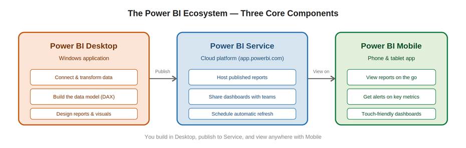
Figure 1 — The three core components of Power BI and how they connect: build in Desktop, publish to Service, view anywhere with Mobile.
Every Power BI project no matter how simple or advanced follows the same four-stage cycle. Learning this cycle is more valuable than memorising any single feature, because it is the mental map for everything you'll do in Power BI.
|
💡 Beginner Explain. |
Think of this workflow like cooking a meal. Get Data is going shopping for ingredients. Transform is washing, peeling, and chopping them so they're ready to use. Model is the recipe — deciding how the ingredients combine and in what proportion. Visualize is plating the finished dish so it looks appetising. And just like a meal, if your ingredients change next time, you go through the same steps again — that's the Refresh loop. |
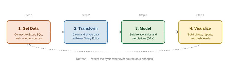
Figure 3 — The four-stage Power BI workflow. The dashed arrow shows the cycle repeating whenever source data is refreshed.
A data connection is how Power BI links to wherever your information actually lives, a spreadsheet, a company database, a website, or a cloud service. Without a data connection, Power BI is an empty canvas; with one, it has something real to analyse and visualise.
|
💡 Beginner Explain. |
Think of Power BI as a TV and a data connection as the cable plugging it into a signal source. The TV (Power BI) is just a screen until you plug in a cable box, an antenna, or a streaming device. Get Data is how you choose what to 'plug in' — your Excel file, a database, or a website — and once connected, your data starts flowing into Power BI just like a channel starts playing on the screen. |
Once you choose a data source, Power BI asks how you want to connect to it. There are two main storage modes; Import and DirectQuery and the choice has a big impact on report speed, data freshness, and what features are available to you.
|
💡 Beginner Explain. |
Imagine borrowing a library book. Import mode is like photocopying the whole book and taking the copy home — you can read it anytime, even without internet, and flipping pages is instant. But if the library updates the book, your copy doesn't change until you photocopy it again (refresh). DirectQuery is like reading the book through a live video call with the librarian holding it — you always see the current page exactly as it is right now, but every single page turn depends on that live connection, so it can feel slower. |
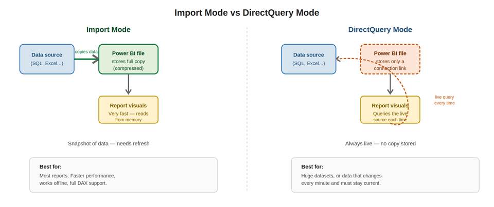
Figure 1 — How Import mode stores a full copy of your data inside the Power BI file, while DirectQuery mode keeps only a live connection and queries the source every time.
Data structuring is the process of reshaping raw data into a layout that is clean, consistent, and ready for analysis. In Power BI, this happens inside the Power Query Editor, a dedicated workspace where every cleaning and reshaping action is recorded as a repeatable step.
|
💡 Beginner Explain. |
Imagine receiving a box of mixed vegetables straight from a farm — some still have soil on them, some are oddly shaped, and they're all jumbled together. Before you can cook with them, you wash, peel, and sort them into separate bowls. Data structuring is exactly this, but for data: you take a messy export from Excel or a database and wash it, split it, sort it, and reshape it so it's ready to be 'cooked' into a report. |
Every structuring task happens in the Power Query Editor, opened by clicking Transform Data on the Home ribbon in Power BI Desktop.
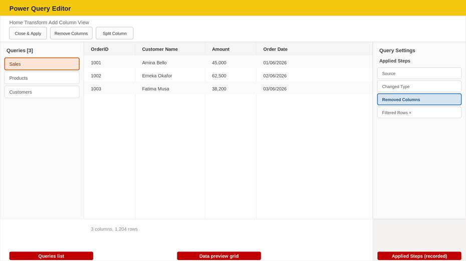
Figure 1 — The Power Query Editor: a Queries list on the left, a data preview grid in the centre, and the Applied Steps list on the right that records every transformation.
|
Area |
Location |
What It Does |
|
Queries pane |
Far left |
Lists every table you've connected to — click one to edit it |
|
Data preview grid |
Centre |
Shows your data exactly as it will look once loaded — edit it live here |
|
Applied Steps |
Far right |
Every click you make is recorded here, in order, as an undoable, re-playable step |
|
⚡ Why This Matters |
The Applied Steps list is the single most important concept in Power Query. Because every action is recorded as a named step, your entire cleaning process can be replayed automatically the next time you refresh — even on a completely new batch of data. You clean once; Power BI repeats your work forever. |
Data management is about keeping your queries, tables, and model organised as your report grows. A report with 3 queries is easy to manage by accident, but a report with 30 queries needs deliberate habits, or it quickly becomes impossible to maintain.
|
💡 Beginner Explain. |
Imagine a kitchen where every utensil is just thrown into one giant drawer. Finding a specific spoon takes forever, and nobody can tell what's clean or dirty. Data management is organising that drawer — putting forks together, labelling containers, throwing out duplicates. A well-managed Power BI file is one where any colleague can open it and immediately understand what each query and table does, just from its name and organisation. |
Data activities are the ongoing, repeated tasks that keep a Power BI report alive and trustworthy after it's built primarily refreshing data, but also monitoring its health and troubleshooting when something goes wrong.
|
💡 Beginner Explain. |
Building a report is like planting a garden — that's the exciting part. But a garden needs ongoing watering, weeding, and checking for pests, or it withers. Data activities are the watering and weeding of Power BI: refreshing the data regularly, checking that nothing has broken, and fixing small issues before they become big ones. |
Beyond simply knowing what a star schema is, a confident modeler understands the principles that decide HOW DEEP a model should go, and when to bend the 'always use star schema' rule. This topic covers granularity, the snowflake alternative, role-playing dimensions, and denormalization.
Granularity is the level of detail stored in a single row of your fact table. Choosing the right granularity before you build anything else will save you from painful rebuilds later.
|
💡 Beginner Explain. |
Imagine measuring a person's height. You could record it to the nearest metre, the nearest centimetre, or the nearest millimetre — each is a different 'granularity' of the same measurement. In a Sales fact table, granularity might be 'one row per order' (coarse) or 'one row per product within an order' (fine). The finer the granularity, the more flexible your analysis — but also the more rows you store. |
|
Granularity Level |
Example Row |
What You Can (and Can't) Analyse |
|
One row per order |
Order #1001, Total = ₦45,000 |
Can analyse order totals — CANNOT see which products were in the order |
|
One row per order line |
Order #1001, Solar Panel, Qty 2, ₦40,000 |
Can analyse by product, quantity, AND order — most flexible, more rows |
|
One row per day per store |
01/06/2026, Store A, Total = ₦230,000 |
Good for trend reports — CANNOT see individual transactions |
|
⚠️ Golden Rule |
Always choose the FINEST granularity your source data can reasonably provide. You can always summarise fine-grained data into a coarser view using DAX or visuals — but you can NEVER break coarse data back into detail that was never captured. Storing 'one row per order line' costs more rows, but keeps every future analysis question answerable. |
A relationship connects two tables using a shared column. Power BI describes every relationship using cardinality (how many rows on each side can match) and filter direction (which way filtering flows).
|
Cardinality Type |
Meaning |
Example |
|
One-to-many (1:*) |
One row on one side can match many rows on the other — the most common type |
One Product can appear in many Sales rows |
|
One-to-one (1:1) |
Exactly one row on each side matches exactly one row on the other |
One Employee has exactly one Employee ID record |
|
Many-to-many (*:*) |
Multiple rows on both sides can match multiple rows on the other — use sparingly |
Students can belong to many Clubs, and Clubs can have many Students |
1. Go to Model view (the icon at the bottom of the left rail in Power BI Desktop).
2. Drag a column from one table directly onto the matching column in another table to create a relationship.
3. Or click Manage Relationships on the Home ribbon to create, edit, or review all relationships in one dialog.
4. Power BI usually detects the cardinality automatically, but you can change it manually if needed.
DAX (Data Analysis Expressions) is the formula language used throughout Power BI's data model. It looks similar to Excel formulas at first glance, but it operates very differently — DAX formulas work across entire columns and tables, guided by context, rather than single cells.
|
💡 Beginner Explain. |
In Excel, a formula like =A2*B2 always means 'multiply THIS specific cell by THAT specific cell' — it is anchored to a fixed cell address. In DAX, a formula like SUM(Sales[Amount]) means 'add up the Amount column' — but WHICH rows of Amount get added depends entirely on what filters are currently active. The same DAX formula can return a different number for every single cell in a report, because each cell applies its own filters. |
DAX Fundamentals means becoming fluent in the building blocks of the language itself on how a formula is structured, which operators are available, and which families of functions you'll reach for again and again. This is the practical toolkit layer that sits on top of the conceptual ideas of row and filter context.
|
💡 Beginner Explain. |
Learning DAX is a bit like learning to cook. Understanding row context and filter context (from the last lecture) is like understanding how heat changes food — the underlying physics. DAX Fundamentals is more like learning your knife skills and the names of your spices: SUM, AVERAGE, IF, FILTER. You won't cook a great meal from physics alone, and you won't write useful DAX from concepts alone — you need both the theory and the toolkit. |
Time intelligence refers to a special family of DAX functions that make date-based comparisons easy: year-to-date totals, comparisons to the same period last year, running totals, and more. Almost every business report needs at least one of these calculations.
|
💡 Beginner Explain. |
Imagine a school asking 'How is this term's attendance compared to the SAME term last year?' Doing that by hand means carefully finding the matching date range from last year and adding it all up. Time intelligence functions are pre-built shortcuts for exactly these calendar-based questions — instead of manually working out which dates to compare, you just tell DAX the pattern ('same period last year') and it handles the date arithmetic for you. |
Performance awareness means understanding why a Power BI report becomes slow, knowing how to measure exactly where the slowness is coming from, and applying simple habits that keep reports fast as they grow. You don't need to be an optimisation expert, you just need to know where to look.
|
💡 Beginner Explain. |
Think of a slow Power BI report like a traffic jam. Something is causing congestion, but you cannot fix it by guessing — you need to know WHICH road is blocked before deciding to build a bypass. The Performance Analyzer is Power BI's traffic camera: it shows you exactly which visual, which query, and which step is taking the longest, so your effort goes exactly where it's needed instead of randomly tweaking things. |
Report design is about deliberately arranging visuals, colour, and space so that a viewer understands the story in seconds, not minutes. Good design is not decoration; it is what makes a technically correct report actually useful to the person looking at it.
|
💡 Beginner Explain. |
Imagine handing someone a newspaper front page versus a wall of plain typed text with the same news. The newspaper uses big headlines, photos, and columns to instantly tell you what matters most. A Power BI report page works the same way — the most important number should be the biggest and the first thing your eye lands on, just like a headline. |
Eye-tracking research on reports and web pages consistently shows people scan in a rough 'Z' shape: across the top, diagonally down, then across the bottom. Good report layouts work WITH this natural pattern instead of against it.
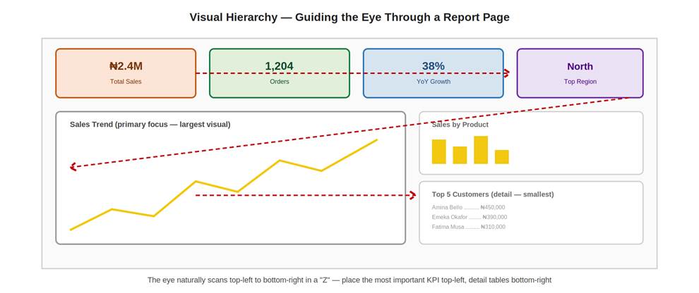
Figure 1 — KPI cards sit top-left (read first), the primary trend chart takes the most space, and the smallest detail table sits bottom-right (read last) — following the eye's natural Z-pattern scan.
|
Design Principle |
Practical Guidance |
|
Most important number, top-left |
Place your single headline KPI (Total Sales, Pass Rate) where the eye lands first |
|
Biggest visual = most important |
Size should reflect importance — don't give a minor detail table the same space as your main trend chart |
|
Group related visuals together |
Keep all regional charts near each other; keep all time-based charts near each other |
|
Leave breathing room |
Don't fill every pixel — empty space helps the eye separate one visual from the next |
|
Limit to one main message per page |
If a page tries to answer five unrelated questions, split it into multiple pages instead |
Power BI ships with a core library of visual types directly in the Visualizations pane. Knowing what each one communicates best — and just as importantly, what it communicates poorly — is the difference between a report that informs and one that confuses.
|
💡 Beginner Explain. |
Each visual type is a different tool in a toolbox, and like real tools, using the wrong one for the job causes problems. A pie chart is a screwdriver — perfect for a few large, simple shares of a whole, but useless (and frustrating) if you try to use it on twenty thin categories. Matching the visual to the question is half of good report design. |
What separates a Power BI report from a static picture is interactivity — the ability for a viewer to click, filter, and explore the data themselves. This topic covers the four interactivity features you'll use in nearly every report: slicers, cross-highlighting, drill-through, and bookmarks.
Formatting is the process of refining how a visual looks, its colours, fonts, titles, axes, and backgrounds, using the dedicated Format pane. This is where a technically correct chart becomes a polished, presentation-ready one.
|
💡 Beginner Explain. |
Building the visual (choosing the chart type and dragging in fields) is like building a house's structure — walls, roof, rooms. Formatting is the interior decorating afterward — paint colours, light fixtures, furniture placement. The house works either way, but decorating is what makes it feel finished and pleasant to be in. |
A report built in Power BI Desktop only exists on your own computer until you publish it. Publishing sends the report to Power BI Service (the online platform), where it becomes a live, shareable report that others can open in a web browser.
|
💡 Beginner Explain. |
Building a report in Desktop is like writing a letter on your own computer — only you can read it until you do something with it. Publishing is like putting that letter into the post: it travels from your machine to a shared online location where the people you choose can open and read the exact same content, without needing your computer or your copy of Power BI Desktop at all. |
This hands-on capstone challenge pulls together every topic from this lecture into one practical exercise. Working through it end-to-end is the single best way to make these concepts permanent.
|
🎯 Your Mission |
Using any dataset you've already built in this course (the student register, sales data, or similar), design and publish a 2-page interactive Power BI report that tells a clear story — not just a collection of charts. |